
Waffle Flower—Sketched Flowers
Hello, Crafters!
I’ve got some exciting news to share! I’m now a member of the Waffle Flower design team! 🥳 I’m thrilled to be a part of this incredible team of designers, and I can’t wait to share inspiration with you monthly! So, thank you to Nina and the Waffle Flower team for bringing me on, I’m so grateful to be here and incredibly excited to share my makes!
Today I’m sharing three cards I made using the new Sketched Flowers stamp sets from Waffle Flower: Sketched Aster, Sketched Chrysanthemum, and Sketched Poppy. These sets are great for those that like to color with copics or pencils, but they are also great for those of us (hi 👋🏻) that prefer to ink blend stamped images since there is a coordinating stencil that adds beautiful dimension to these blooms.
Go Big or Go Home

You might start to notice it in the coming week or so, but I think I’m entering my 5 x 7 era. Scandalous, I know!! I’ve never really cared to make 5 x 7s since the extra space can be quite intimidating to me, but it really made sense with this card! I had it in my head that I wanted to use as many of the sketched flowers as I could on a card, and this can be done since the styles are the same, meaning that nothing will look weird or out of place when they’re used together, but this is what made this sized card necessary.
I started off by stamping the Sketched Aster and Sketched Marigold on some Concord & 9th white cardstock using Altenew Jet Black fresh dye ink. Once I felt the ink had dried down, I stuck my cardstock down on my large grip mat and lined up the Sketched Aster Stencil. I decided to go a little true to color of real-life asters, so I pulled out Water Hyacinth, Alpine Aster, and Crystal Violet fresh dye inks from Altenew and blended them onto the petals. For the flower center, I used Honeycomb and Stardust ink. For the stem and leaves, I used Avocado ink as my base layer, and Artichoke ink as my shadow/detail color. I love these greens for greenery!
Now onto the marigold! Traditionally, everyone thinks of Marigolds as vibrant orange and yellow flowers, but I’m here to tell you that there are more varieties than you may think! My new favorite that I discovered about two years ago is the Strawberry Blonde Marigold, and it is beautiful! It’s more of a soft peachy color than vibrant in your face color, so that was my inspiration. I started off blending the base layer with Nectar ink, then added Creamsicle ink for the mid-tone shadows. For my darkest color, I pulled in Watermelon ink then removed the stencil and blended on some Honeycomb ink to bring some yellow into the flower. I’m thrilled with how this flower turned out! For the greenery, I used the same colors as I did with the aster so that the stems wouldn’t compete against each other when they were side by side.

With my flowers ready to go, I could get started on my card front. I decided to use Grasshopper cardstock for my card front, and honestly, I’ve been a bit obsessed with this green! Lately I think I’ve been using it more as a neutral because it’s been a card front color of mine for three cards this past month haha! I wanted to add a bit of interest to the background since it’s such a large card, so I pulled out the Random Hearts stencils and some Grasshopper ink and got to work. This stencil is meant for A2-sized cards, but I just moved it around and lined it up the best I could to repeat the pattern.
I wanted to use the Inside/Outside Scalloped Elongated Oval frame on this card, so I die cut it out of Ivory cardstock. I could have used white cardstock, but I like the warmth that this brings vs. a stark white. I die cut two more frames so that I could stack the scalloped frame up a bit more, then I glued it on the card front pretty close to the top edge of the card. With the scalloped frame in place, I could glue the Ivory smooth oval frame down inside of it. Before adding my flowers to the card, I had to figure out my sentiment first. I decided to use the Oversized Get Well Print die as my main sentiment and I cut it out of matte gold cardstock and two layers of white die cuts. Once I had it stacked up, I glued it down more to the top of the inside of the oval. I wanted a subsentiment, so I used the ‘feel better soon’ subsentiment from the Subsentiments Care Diecut and added it below the ‘get well’.
With all that done, I could finally add my flowers. I decided to pop the aster up on some thin foam squares off to the right of the card front, and the marigold up on thick foam squares to the left. This filled in the space pretty well, but I thought some shine was needed, so I pulled out the Neutrals sequin mix from Concord & 9th and scattered the more ‘clear’ ones around the flowers.
Pretty in Purple

Now this one is packed full of purple! I’ve always said greens were my favorite color, but I think purples are working their way up there too! I started off by stamping the Sketched Chrysanthemum in Altenew Jet Black ink on some Concord & 9th white cardstock. For my purples, I went with Altenew since I needed three colors that increased in darkness, so I used Wisteria, Hydrangea, and Ultraviolet fresh dye inks on the bloom. For the greenery, I went with more true greens this time and blended on Parsley ink for the whole stem/leaves, and Evergreen ink for the shadows/leaf details.
With my flower colored in (I’m so thankful these florals have stencils!), I die cut it using the coordinating die and got to thinking about how I wanted to create this card. Since I had a leftover Ivory scalloped frame from my last card, I decided to use it on this one, but I really wanted a backer behind the scallop. So, I took a piece of plain white cardstock and traced around the frame then fussy cut it out. I thought it would be fun to add a little bit of subtle texture to the oval, so I dry embossed the Random Heart stencil using the recommended sandwich on my Platinum 6. I lined the chrysanthemum up on the oval backer making sure I got the whole bloom and as much greenery as possible in the frame and glued it down. Next, I glued the Ivory frame over the oval backer and set it aside.
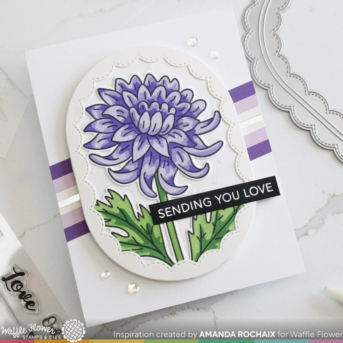
I really wanted to pull some purple into the background, but I felt a fully purple card front would be a bit too punchy. So, I settled for the next best thing: stripes! I decided that I would have a plain white card front, so for my stripes I pulled out Grape Soda, Lilac, Ivory, and matte silver cardstock, which I cut to 1/4-inch for the purples, just under that for the Ivory, and about 1/8-inch for the matte silver. I think the different stripe thickness adds a nice touch to this card. I glued the stripes down, then popped the scalloped oval up on some 1/8-inch foam strips from Waffle Flower.
The sentiment for this card actually came from the Sketched Marigold stamp set, and I white heat embossed it on black cardstock. I cut the sentiment down so that it was a sentiment strip, then I glued it onto the scalloped oval, just below the bloom. To finish this card off, I again thought some sparkle was needed, so I took the same sequins from the last card and added two groupings of two at the top right and bottom left of the card. I thought this did a great job pulling more attention to the scalloped oval.
Clean & Simple Sympathy
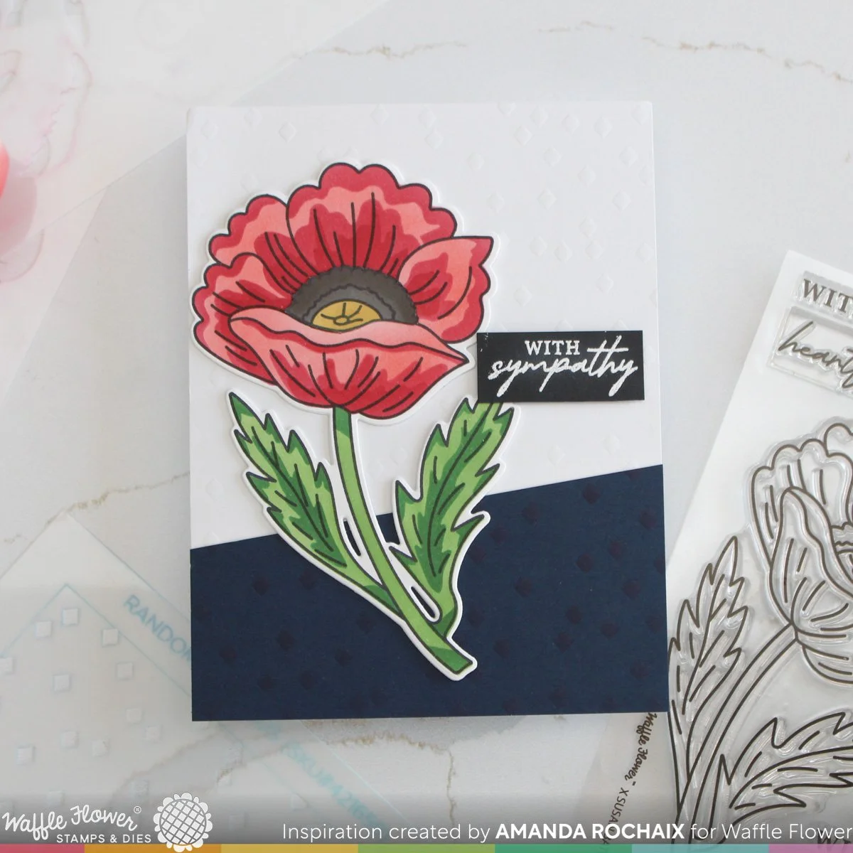
For this card, I got a little stuck in my head with red poppies. I kind of went with a remembrance/sympathy vibe with this card, because all I could think of was how people would wear red poppies in remembrance of those lost in wars. So, with that in mind, I stamped the Sketched Poppy stamp on Concord & 9th white cardstock using Altenew Jet Black ink. I pulled out Poppy ink and blended on the base layer of ink. This does cause the flower center to be red, and I’ll get to what I did about that soon! For the second layer, I pulled out Cranberry ink, which I blended with a heavier hand on the third layer (it isn’t super noticeable, but the flower looks good enough to me!).
Now, back to that flower center! I actually messed it up after I realized it was a bit too red for me, so I stamped a second poppy, then blended the flower center on using Stardust and Mushroom inks. I pulled out my 0+ shader brush and went a little bit heavier with Mushroom ink on the outer edge of the outer ring of the flower center. This added a nice bit of shading/depth to the flower center since it’s pretty dark on the edge and a bit lighter around the yellow center. I fussy cut the flower center out and glued it on the poppy. For the greenery, I pulled out Parsley and Evergreen inks and blended them on.

I was really stuck on the background of this card for some reason, but I knew I wanted to bring in some dark blue to add a bit of drama. I pulled out Midnight cardstock and decided to use the Random Rhombus stencil on it with Midnight ink. This was super subtle, so I lined the stencil back up and dry embossed it so the rhombuses would stand out a little more. I thought a totally blue background would be a bit too dark, and after going back and forth between cutting 1.5-inches off the bottom of the panel in a straight line or a diagonal one, I eyeballed a diagonal one and cut my panel with my paper trimmer.
When I lined up my Midnight piece on the bottom of a piece of white cardstock, I thought the white cardstock felt a little flat. So, I dry embossed with the stencil again, which was cool because then I had a pattern that was consistent across the colors. I glued my Midnight piece on the bottom of the white cardstock, then added a few poppy die cuts behind the colored in poppy for some dimension, then glued it down. I white heat embossed the ‘with sympathy’ sentiment from the stamp set on black cardstock, popped it up on some thin foam squares, and after a bit of indecision, called this card done. I wasn’t sure if adding sparkle was appropriate here, and I honestly couldn’t get a sequin layout that I liked, so I left it be. What would you do?!
Thanks for stopping by the blog today! I hope you liked these three cards, I had a lot of fun making them. I hope to catch you next time with more inspiration!😊
Affiliate disclaimer: all links to Waffle Flower, Altenew, Scrapbook.com, and Spellbinders products are affiliate links. These links allow me to get a commission at no extra cost to you if you use them to shop! All other links provided are links to supplies and shops I am not affiliated with and I do not get a commission from.