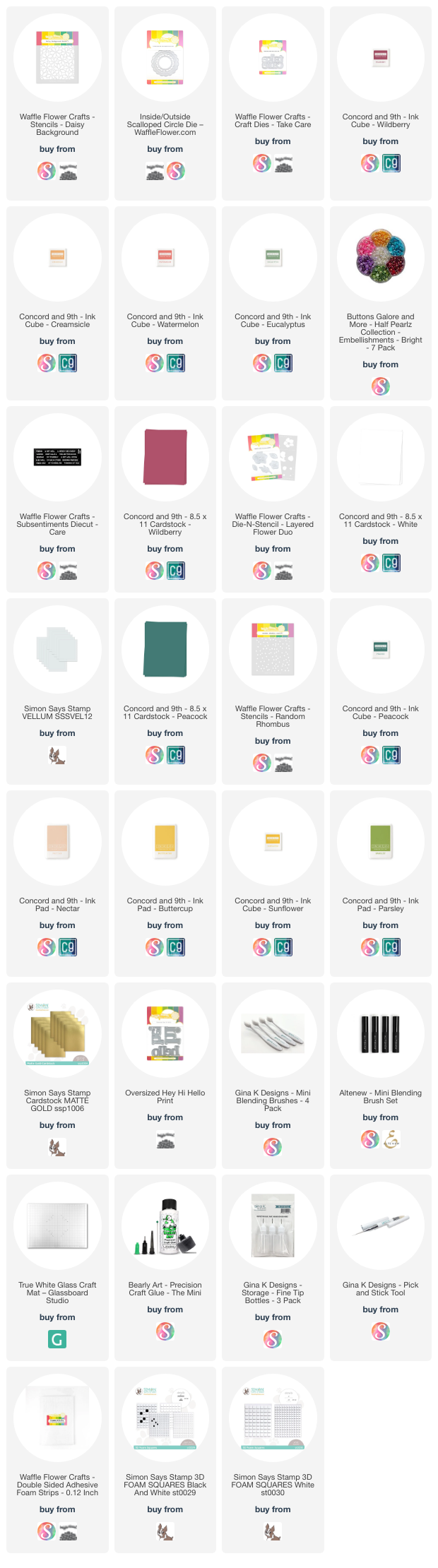

Waffle Flower— Flower Frames
Hello again!
Today I’ve got a couple more fun cards to share featuring the June release from Waffle Flower!
Daisy Background Beauty

Okay, so I know the other day I said that my ‘chaotic’ card where I created a handful of different postage stamps was my favorite that I created with this release, but that might be a lie 🤭. I loooove this card. It’s probably because I’m a flower girly through and through and I adore the color palette I used on this card, but either way, this is a great card!
My main focus when I was working on this card was the Daisy Background stencil, and after making a cute jungle-themed card with some Sizzix products, I thought to use the same color palette of Wildberry, Watermelon, Creamsicle, and Eucalyptus inks for the flowers. So, I did some random spotlight blending to have a variety of different colored flowers (and I recommend using at least 4 colors to do this since it makes it a little easier to vary the colors), and I really love how the panel turned out!

For the sentiment, I knew I wanted to use the new Oversized Take Care Print die, so to stick with the color palette, I die cut it out of Wildberry cardstock. I thought the panel was a bit too distracting just to slap a word die on and call it done, so I die cut the Inside/Outside Scalloped Circle die out of white cardstock and traced the inside of the frame on vellum. I fussy cut the vellum circle a little bit on the outside of my traced line so that I had a little bit more of a margin to add glue on so I could adhere it to the back of the scalloped frame. I glued my sentiment (which I added a white die cut layer to) onto the vellum circle, then decided to add a ‘& get well soon’ subsentiment from the Subsentiments Care diecut underneath it. I added some 1/8th-inch thick foam on the back of my scalloped frame and behind my sentiment and popped it on my card front, and wow! I love the depth this loft of foam added and how it blurred the background to really make the sentiment pop. To finish things off, I wanted a bit of shine, but not the sequin variety! I decided to pull out some yellow pearls from Buttons Galore & More, and in this variety pack there are yellows in two different sizes, though the shine varies a slight bit between them. I love how this sweet card turned out!
A Card with Contrast!
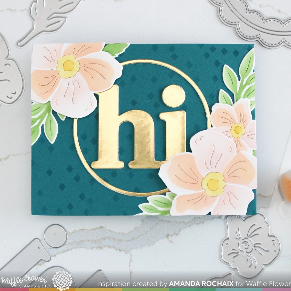
If you’re familiar with the color wheel, you might know that blue and orange are contrasting colors. This just means when you put them next to each other, they really pop, (but you shouldn’t mix them together in ink or paint mediums since they will make brown). I decided to lean into that pop and go with orange flowers on a blue background.
Since I knew I wanted orange for the flowers, I started on those first. After die cutting the flowers, I lined up the stencils and blended on Nectar ink for the base petal layer, Creamsicle for the darker petals, and Buttercup and Sunflower inks for the flower centers. For the leaves, I used Parsley ink and blended the centers a little bit heavier than the rest of the leaves.
With my flowers ready, I started to think about layouts. I still wanted to pull in a frame, but a scalloped one felt like it would be too busy for the vibe I was going for. I decided on using the plain circle frame that’s between the scalloped layers, so I cut it out of matte gold cardstock. From here, I knew I wanted to use a sentiment that fit in that circle. After going through my stash, I decided on the ‘hi’ from the Oversized Hey Hi Hello Print die set which I cut it out of the same matte gold cardstock.

I decided on Peacock cardstock as my card front color and got to thinking about the orientation of the card. After playing around a little bit, I couldn’t get a layout I liked in a portrait orientation, so I rotated my card front and really liked how things were looking as a landscape card. I focused the blooms in opposite corners of the card front and made the lower right cluster heavier than the upper left so that it didn’t look exactly the same. With everything laid out, I felt a little something was missing, so I pulled out the Random Rhombus stencil and some Peacock ink for some tone-on-tone interest. The direction of the rhombuses (rhombi? Is there a plural for this? haha) would have been going side to side if I lined my stencil up how it was supposed to be, and I wasn’t into that, so I lined up the stencil on the far-left edge first (with the stencil in its portrait orientation) and did my ink blending, then I moved it over to the right to fill in the remaining portion of the card front and kind of matched things up to the best of my ability. I don’t think the stenciling turned out too bad!
To assemble my card, I glued down the gold circle frame (which had one white die cut underneath it) and the ‘hi’ (which I stacked up with two white die cuts). I glued the leaves down to the card front, then popped the large blooms up on thick foam squares, and the small bloom up on thin foam squares. I really like how the flowers hang over the frame and the ‘hi’—it feels so cozy!
That’s all I’ve got for the June release from Waffle Flower! I hope you liked these cards and the inspiration I shared! 💗
Affiliate disclaimer: all links to Waffle Flower, Altenew, Scrapbook.com, and Spellbinders products are affiliate links. These links allow me to get a commission at no extra cost to you if you use them to shop! All other links provided are links to supplies and shops I am not affiliated with and I do not get a commission from.