Altenew—Flowers and a Flamingo: For Those Who Love to Color and Those Who Don’t.
Hello, friends!
Today I’m back with more Altenew content featuring their June release! The set I’ll be focusing on today is the Flowers and a Flamingo stamp and coordinating die set, and it’s a fun one! If you’re me, it’s a bit intimidating only because I literally tend to shy away from images that don’t have coordinating stencils because coloring with copics and pencils literally stresses me out haha. I feel like everything I color kinda looks like an elementary school student did it, but hey, the only way from here is up! So, with that in mind, I’m going to share two cards with you today—one that leans into alcohol marker coloring, and another that has no coloring involved!
Flamingo Shaker Card
Since coloring isn’t my strong suit, I decided a shaker card would be in my best interest since I didn’t have to set a scene and maybe some sequins would distract from my coloring. I pulled out a piece of 4.25 x 5.5-inch white cardstock and heat embossed the flamingo using ultrafine black embossing powder from Simon Says Stamp. Once it was cool, I got to coloring. The alcohol markers I use are Ohuhu alcohol markers and they’re much more affordable than Copics, which as a beginner is great news! I used R12 as the base color of the flamingo and R9 as my darker shade to add a little bit of depth. For the legs and beak, I used CG5 and CG II O4 and a touch of black. For the grass, I used GY5 as my darker shade, and blended that out with GY4. I really like how the grass turned out, the flamingo isn’t my favorite, but I made do with what I had!
With the image colored, I could move on to my shaker window. I decided to use the third largest Ornate Nesting die as my window because I thought it was a bit more fun than a basic shape. I thought about using pink cardstock for my shaker window, but none of my pinks felt right—they were either too aggressive, or the tones were just wrong. I decided to cut the shaker window out of white cardstock, but to make things a little more interesting, I added some texture to the cardstock with the Dotted Waves cover die. With that done, I added some acetate to the back of my window and set it aside to dry.
To give things a little bit more life, I decided some ink blending behind the grass and flamingo was needed. I wanted something light and subtle, so I pulled out Strawberry fresh dye ink. After cutting a mask out of plain white cardstock using the coordinating die and sticking it down with some easy see tape (you can definitely use masking paper! I was too lazy to go hunt some down), I started blending the strawberry ink on. I focused/blended it with a heavier hand near the grass and the flamingo’s feet, then faded it out as it got higher.
I was happy with how things were looking, so I made my shaker well with some foam tape and picked out my sequins. Originally, I was thinking of using some fun coral or pink sequins, but I wasn’t really into the look. Instead, I made my life difficult and picked out the clear sequins in the Neutrals sequin pack from Concord & 9th. This clear sequin has a nice shine thar was just what I needed, so the grueling work of sorting them out was worth it to me! (and yes, I have ordered some clear sequins since haha).
All that was left to finish this card up was my sentiment. I really liked the ‘stand tall and be fabulous’ sentiment for this card, so I heat embossed it on black cardstock using Alabaster embossing powder from Brutus Monroe. I added it to the card to the right of the flamingo with some thin foam squares and called this card done.
An Elegant Wedding Card
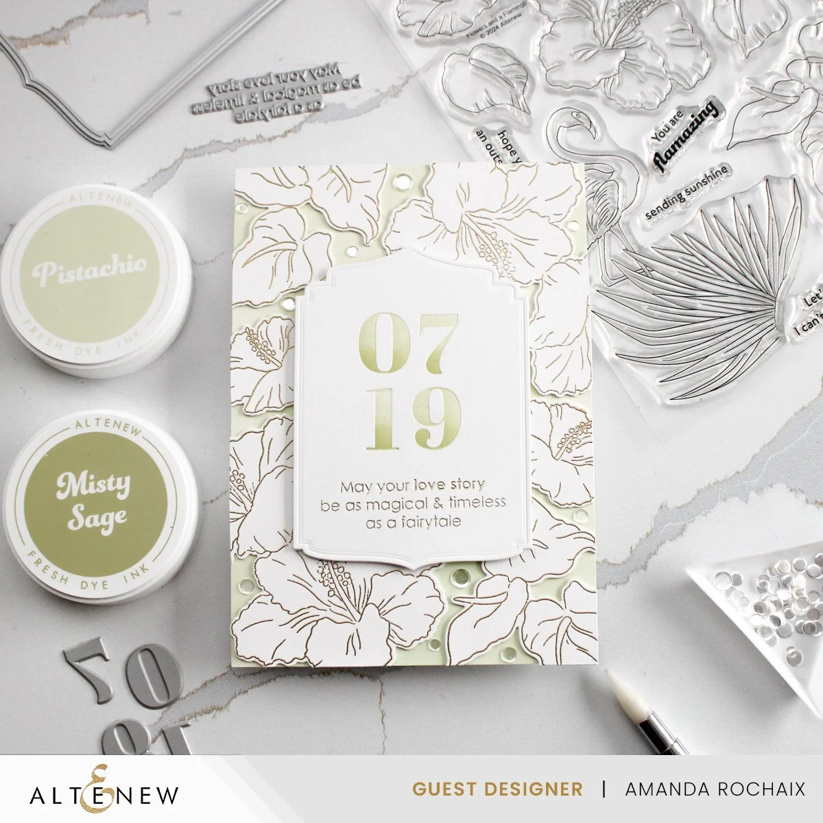
Who would have thought not coloring could look so good?! This stamp set is packed with beautiful hibiscus flowers and tropical foliage which can look just as beautiful colored as not colored. After making a background out of Japanese Anemone flowers, I was once again, thinking of making a background of flowers and foliage. So, I heat embossed each image twice using Gilded embossing powder from Brutus Monroe. I cut the images out using the coordinating dies as well as two die cuts of each image so that I could stack them up for some dimension and stability.
By now I knew I was making this card for some friends that are getting married next month, so I leaned into their color scheme a little. Their invite came in a nice light green envelope, so I cut a piece of Concord & 9th white cardstock to 5 x 7-inches, and I blended Pistachio fresh dye ink over the whole thing. I loooove this color! While my panel dried down, I moved onto the sentiment/focal point. I recently picked up the Love Story press plate, and since I knew the day our friends were getting married, I decided to Betterpress the date on some white Betterpress cardstock. I thought it would be really fun to play with the greens again, so I did a little bit of an ombre Betterpress using Pistachio and Misty Sage fresh dye inks by first pressing the cardstock with the Pistachio ink, then focusing the Misty Sage ink on the bottom of each number and pressing the cardstock again. (also, as a side note, when I Betterpress, I do use two of the included shims! So, if your impression isn’t deep enough, add some shims!).
If you can’t tell, I’ve been a bit obsessed with the Ornate Nesting die set with my design work this month, so of course, I decided I wanted to use it again here. It really adds to the elegance of this card, so I’m happy I did! I lined the second largest die in the set up and cut out my Betterpressed date. One tip I do have is when you know you’re going to cut your Betterpress cardstock down with a die, definitely do your pressing in the middle of your cardstock! I find this makes it oops proof for me, meaning I won’t run out of cardstock space to cut it down with a specific die.
With my cardstock cut down, now I could add a subsentiment. I really liked two of the sentiments in the Love Story press plate set for a wedding card, but due to the shape/size of the ornate nesting die, I decided to foil the ‘may your love story be as magical & timeless as a fairytale’ sentiment using Champagne Glimmer foil. This is my favorite gold foil, and I love how well it goes with the gold embossing!
Now that my sentiment was ready, I could finish up my background. I started by placing the large double hibiscus image in the upper right and lower left corners, but their direction was the opposite of each other. The bottom left is pointing up and out, and the upper right is pointing down and in. I did this so that things don’t look too similar at first glance. To the side of the hibiscuses, I put the cluster of three anthurium leaves, and above (or below in the case of the top flower) the hibiscus, I added the single, smaller hibiscus. Once I was happy with how things were placed, I snuck the tip of my glue bottle underneath the images and stuck them down. I could have picked them up individually (didn’t trust myself to get them exactly where they were) or with Press’n’Seal (was too lazy to go get it), so keep that in mind!
I popped my sentiment up on some foam tape which I focused in the middle of the ornate shape to avoid the die cuts glued to the background, and stuck it down. I looooved how the card was looking, but I thought a little bit more shine was needed. I pulled out my Rock Candy sequins from Trinity Stamps and scattered them around. I really just tried to fill in the gaps a little bit, and what I love about this sequin mix is that it has three different sizes, so filling in the gaps was pretty easy!
That wraps up the cards I created with this stamp set! Tell me, do you love coloring, or are you like me and you avoid it unless you have stencils?! I’m pretty pleased with how both of these cards turned out, and I can’t wait for our friends to get their wedding card. 💗
Affiliate disclaimer: all links to Waffle Flower, Altenew, Scrapbook.com, and Spellbinders products are affiliate links. These links allow me to get a commission at no extra cost to you if you use them to shop! All other links provided are links to supplies and shops I am not affiliated with and I do not get a commission from.


