
Altenew—Botanical Honeycomb Bundle Three Ways!
Hello, hello!
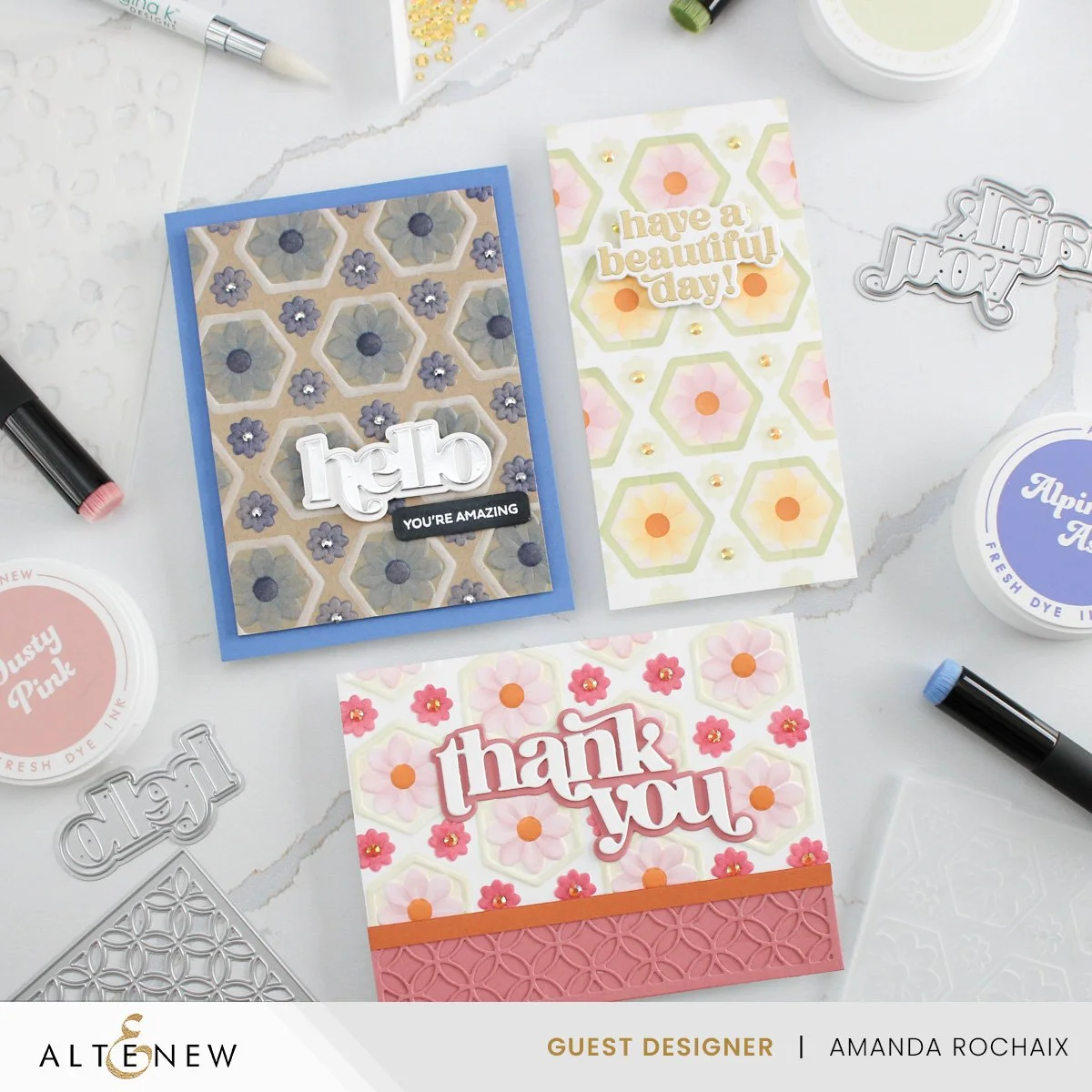
Today I’m back with what feels like a series for me haha, one product used three different ways, with the focus on the new Botanical Honeycomb bundle from Altenew. This bundle consists of a fabulous 3D embossing folder and a coordinating stencil, which gives you the option to use the 3D embossing folder alone, with the stencil, or the stencil on its own. Today I’ll be showing you how this bundle looks on colored cardstock, white cardstock, and as a mini slimline using only the coordinating stencil.
We’ve Got the Blues
So one thing that I’m maybe a little weird about is white space on a card. Sometimes the blank areas around a stenciled card front can feel overwhelming to me and make me question my sanity haha! Am I really that scared of white space? Is it really ‘too much’? I decided to avoid that dilemma by creating this card with a kraft cardstock base, specifically Wheat cardstock from Concord & 9th. Before running the A2-sized cardstock through my Platinum 6, I made sure to lightly mist it to help avoid paper cracking. Once I was certain it was dry, I got to stenciling. On the first stencil, I used Alpine Aster fresh dye ink on the large flowers, and Crystal Violet fresh dye ink on the small flowers. I lined up the second stencil and finished coloring in the large flowers with Alpine Aster ink.
On the third stencil, I used Indigo Skies for the flower centers, and Concord & 9th white pigment ink for the hexagon outline. Keep in mind that for the third stencil you do have to flip the stencil 180 degrees in order to ink both sides of the hexagon outline! After letting the pigment ink dry, I lined the fourth stencil up and blended on Water Hyacinth fresh dye ink. Since this is such a light ink, it really didn’t show up on the Wheat cardstock, but I decided what I had was good enough, so I left it alone. If you wanted it to stand out, you could have blended on white pigment ink first, let it dry, then add the Water Hyacinth ink.
I cropped my panel down to 3.75 x 5-inches using my A2 Layers dies from Waffle Flower, then after a bit of back and forth on color, I decided to mat my panel on Lapis cardstock from Hero Arts. The cardstock isn’t a perfect match, but it fits the vibe pretty well! For the sentiment, I decided on ‘hello’ from the Timeless Sentiments die set. I die cut the word out of matte silver cardstock and a few layers of white cardstock for dimension, and the shadow out of white cardstock. I wanted a subsentiment for this card, so I went to the Flourishing Garden stamp set and white heat embossed ‘you’re amazing’ on black cardstock. To cut the sentiment out, I used the Featured Sentiments die set, and I love that this takes all the work out of cutting sentiments! That is one thing that if I have to do it manually, it’s not my favorite (I tend to gaslight myself into thinking my lines are never straight 😂). To bring some more shine to this card, I decided to add some silver gems to the smaller flower flower centers. I love the touch that this adds to the card, it really brightens it up!
A Sweet Thank You Card
On this card, I switched it up a little bit. I decided it was time to conquer my overthinking on a white background, and to make things a little more fun, make this card a landscape orientation. I started off by running a lightly misted A2-sized piece of Concord & 9th white cardstock through my Platinum 6, using the recommended sandwich.
I popped my panel on my grip mat and lined up the first stencil. I really wanted to play with more of the new fresh dye inks that were released this month, so I blended on Dusty Pink for the large blooms, and Raspberry Sunset on the small flowers. With the second stencil, I completed the large flowers using the same Dusty Pink ink. On the third stencil, I decided to use Melted Butterscotch for the flower centers, and I absolutely love this color—especially for flower centers! For the hexagon outline, I went light and blended on Pistachio ink. I maybe went a little too light on this, but I think it looks pretty good, and it’s a bit more visible in real life! For the fourth and final stencil, I made a maybe questionable decision, and blended on Peachy Glow in the area behind the large flowers. This came out really light, so it’s almost unnoticeable, but if I blended with a heavier hand it would have stood out more. All in all, I’m really happy with how this panel turned out! I love the colors!
Next, I thought about my sentiment. In case you can’t tell with my guest work this month, I’m a bit obsessed with the Timeless Sentiments die set. So, of course, I had to use the die set again, but this time I die cut the ‘thank you’ out of white cardstock, and the shadow out of Velvet Rose cardstock from Spellbinders. I found the Velvet Rose cardstock played pretty well with both shades of pink on the card, and the tones felt pretty similar. Originally, I was thinking of making this card a portrait orientation, but after seeing the die cut greeting on it, I felt that things felt a bit too empty and a bit too white.
With the goal of bringing in more color to the card, I cut a strip of the Velvet Rose cardstock to 1.25 x 5.5-inches and I lined it up on the bottom of my card front. I really liked how this was looking and how it tied into the sentiment shadow layer as well, but it was feeling a little bit too bland for the card. After going through my stash, I pulled out the Circle Quilt cover die and die cut another piece 1.25 x 5.5 -inch Velvet Rose cardstock. After popping out all the small fallout pieces, I glued the intricate texture onto the plain piece of Velvet Rose cardstock, then glued the strip on the bottom of my embossed panel. I wanted to soften the edge of the strip a little bit since it had an unfinished edge on the top, so I cut a 0.25-inch strip of Spiced Cider cardstock from Concord & 9th and glued it on the top edge of the Velvet Rose piece. These cardstock colors are so beautiful together and they work so well with the fresh dye ink colors!
From here, all that was left was to glue my sentiment down and add some sparkle. I decided to forgo foam squares when adhering my sentiment, and instead just glued it down on the middle of the card front. The sentiment was stacked up a bit and with the texture and loft of the embossing, I thought this was good enough! I also really love how balanced the card feels, it feels like the greeting takes up the right amount of space, and so do the cardstock strip and the colorful embossing pattern. To bring some shine to this card, I once again decided that all the small flowers definitely needed some gems. I pulled out my Holiday Jewelz Mix from Buttons Galore & More again, but this time I decided to use the light amber colored gems. I like that this kind of mirrors the flower centers on the large flowers and I think it looks really pretty!
Mini Slim Stenciled Card
Wrapping up this rodeo is this vintage feeling, stenciled mini slimline. It’s kind of giving vintage kitchen towel vibes, but I’m not against it! I wanted to share this card to show that if you don’t want the embossing folder, you can still enjoy this design using the stencil only
I started out by cutting a piece of Concord & 9th white cardstock to 3.25 x 6.25-inches, then stuck it on my grip mat. I decided to stick with similar colors to the last card because I was really loving them, but this time I decided to make the large flowers Dusty Pink and Golden Honeycomb and alternate the color with each row. For the small flowers, I used Pistachio ink, and because the stencil measures 6 x 6-inches, I was left with some empty space on the top and bottom of my card front. Originally, I thought of just leaving the space blank (and honestly I kinda regret not leaving it blank), but I decided to fill in the empty space with more Pistachio flowers. I moved the stencil so that it lined up with the large flowers that were stenciled, which in doing so, added the small flowers in the right spot. I inked the stencil, then repeated the process with the top of the card.
I completed the large flowers using the second stencil, then got ready to add more color with the third. I decided to keep the same Melted Butterscotch ink for the flower centers since it was so pretty on the last card, then after a lot of debating, I added the hexagon outlines using Misty Sage ink. With the last stencil, I decided to add two different backgrounds to the different colored flowers. Behind the Dusty Pink flowers, I blended on Peachy Glow ink, and behind the Golden Honeycomb flowers I blended on Strawberry ink. These colors are both super light, so it’s a subtle detail that is definitely more visible in real life!
For a sentiment, I decided on ‘have a beautiful day!’ from the Classic Greetings stamp set, which I gold heat embossed and die cut out. I popped the sentiment up on some thick foam squares and stuck it down on the upper middle portion of the card. To add some shine, I went with the same light amber gems that I used on the previous card and added them to the centers of the small Pistachio flowers. I think this card turned out really cute and different from the last two and that makes me happy!
So, that wraps up this post! Are you a matching stencil type of crafter?! I love having matching stencils for all the things—stamped images, embossing folders, die cuts—literally everything! I hope you enjoyed these cards, and I hope to catch you next time with more inspiration!
*** At the time of writing this, I have realized that Velvet Rose cardstock is not sold on Spellbinders’ website anymore. I linked to it on Scrapbook.com, but it is sold out there and I’m not sure if it’ll be back in stock. Maybe Dahlia from Spellbinders, Raspberry Sorbet from Taylored Expressions, or Dusty Rose from Gina K would be a close match, but since I don’t have those cardstocks I’m not 100% sure. Also, Lapis cardstock is no longer sold on Hero Arts either, I’m so sorry! I feel like a jerk for having used these today, but the closest I can find on the internet for this is potentially Cornflower Blue from Heffy Doodle or Simon Says Stamp, and maybe Gumball from Taylored Expressions. Again, I’m not 100% confident in these matches since I’m seeing the colors on my computer screen.
Affiliate disclaimer: all links to Waffle Flower, Altenew, Scrapbook.com, and Spellbinders products are affiliate links. These links allow me to get a commission at no extra cost to you if you use them to shop! All other links provided are links to supplies and shops I am not affiliated with and I do not get a commission from.