
Pretty Pink Posh— Build a Gift Masculine Birthday Card
Hi crafters!
Today on the blog I’m sharing a colorful, more masculine leaning birthday card using Pretty Pink Posh’s Build a Gift die set. This die set is so fun to use, and you really can get the bang for your buck since it can be used for a variety of occasions besides birthdays. I’m hoping to use this die set on some Christmas cards this year as well!
Anyway, I made this birthday card with my grandpa in mind since I was in need of a birthday card. Often times when I’m starting a project, I can be paralyzed with making decisions on color schemes. I tend to over think, or I don’t want to start die cutting or stamping because I don’t want to waste my inks or cardstock (surprise— it won’t ever be a waste since these can be used on future projects!). My favorite tool to combat this lately is using a book one of my favorite watercolor artists had mentioned. The book, Palette Perfect by Lauren Wager, is an amazing tool! It has sooo many different examples of color palettes and breaks them into categories such as ‘dreamy’, ‘romantic’, ‘playful’ and lists the CMYK and RGB color values. So when I started this project and I didn’t know what to do for a color palette I looked through Palette Perfect and I found a great color scheme!
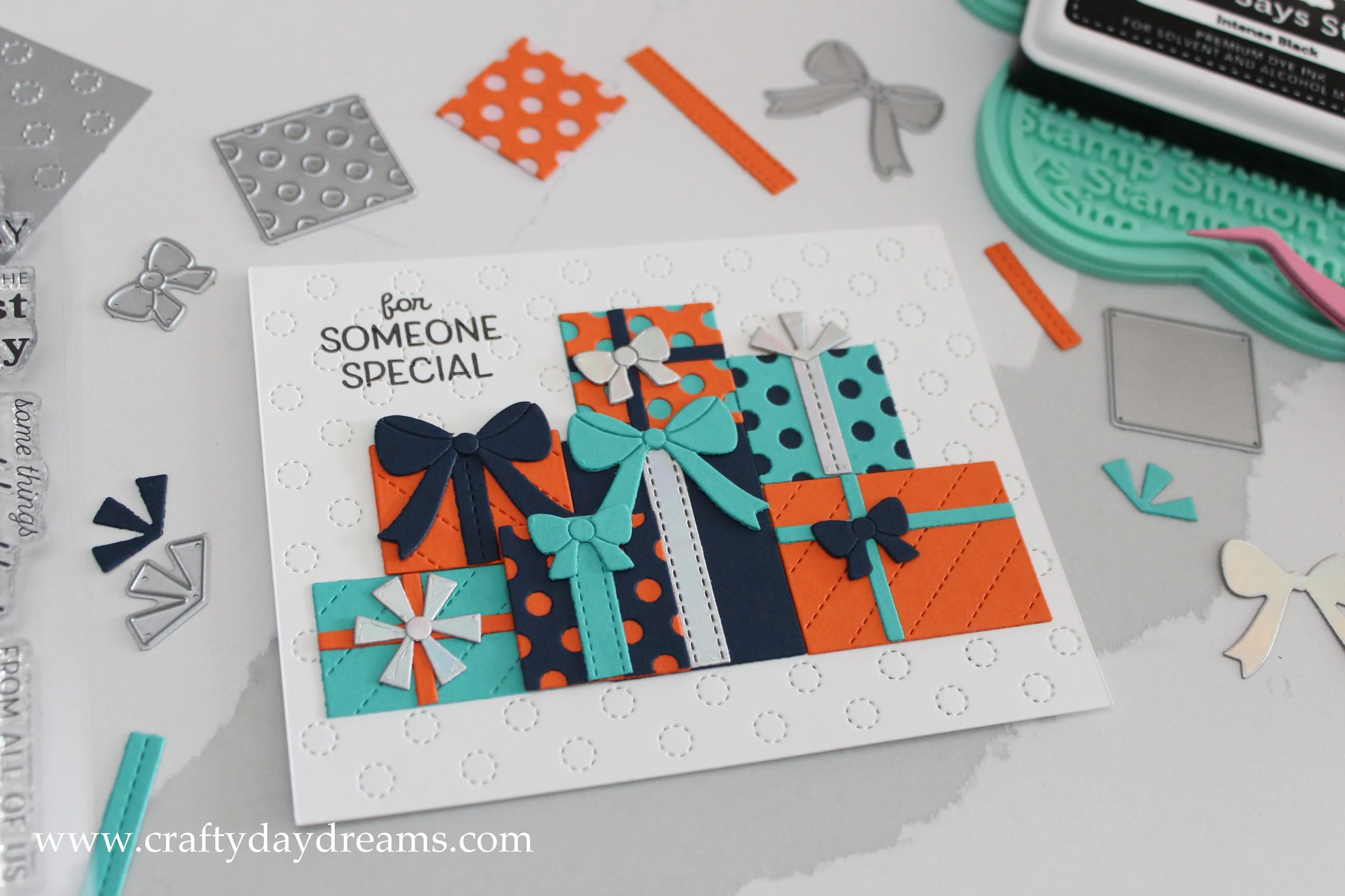
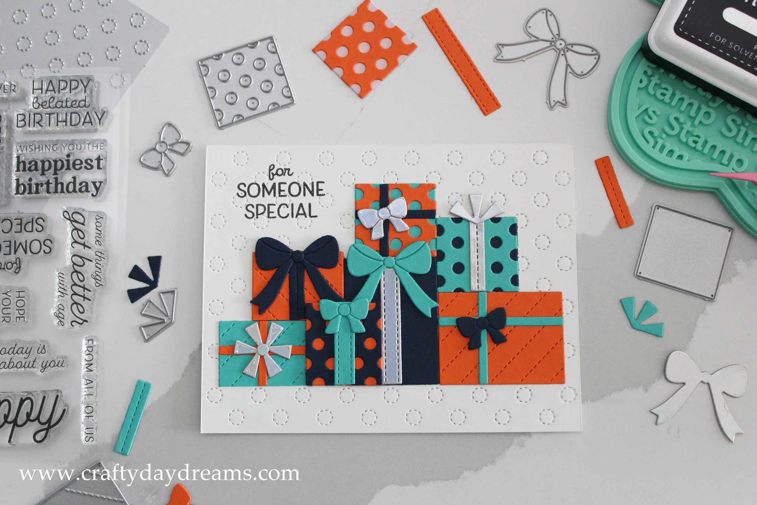
The palette I chose had orange, a dark blue, a mid-toned blue-green, and a light pink. When I saw this I thought great, I have cardstock from Concord & 9th that literally matched these colors perfectly! I am obsessed with C9 cardstock, and I pretty much use it exclusively. So the colors I die cut for this project were Ballet Slippers, Marmalade, Oceanside, and Midnight. I die cut the whole die set out of each of these colors and started to make presents. As I was assembling, I felt that using only 3 of the colors made the present stack a little less busy, so I dropped off the Ballet Slipper presents and am storing them for a future project. I also die cut bows and ribbons out of holographic cardstock that I bought from Michael’s (pretty sure it’s the Recollections brand). Funny enough, the color scheme turned out very close to my home state baseball team, the Detroit Tigers, which my grandpa loves.
When it came to placing the presents on the card front, I wasn’t sure how I wanted to lay them out, so I went to Pretty Pink Posh’s website to look for some inspiration. I liked how Lindsey Larsen on their design team had stacked their presents, so I decided to do something fairly similar. Another thing I learned this time around using this die set, is to cut presents down and make different shapes out of them, and to glue them down in different ways (like vertically or horizontally). I cut the large stitched one in half and made a smaller rectangular gift out of it. You could even cut the square dot one in half and make a cute, thin rectangle present. Also, don’t be scared to Frankenstein the ribbons and bows! For one of the presents, I took two of the spiky bows and glued them together and covered the seam with the circle that one of the other bows cuts out. I love how it turned out!
When I laid the presents out on the card front, I thought the background was a bit plain. I didn’t think colored paper or patterned paper was the way to go, but I had just gotten my June Concord & 9th order in the mail when I was making this card, so I decided to use the new Stitched Polka Dot card front die. I think this background die paired perfectly with the presents, it plays nicely with the dots on the presents and the stitching on the ribbons. After gluing the presents down, I decided I wanted a sentiment on the front of the card. I thought about stamping one on cardstock and placing it in the corner, but to me, it was too much visually. I ended up stamping ‘for someone special’ from the Spellbinders Many Birthdays stamp set (LOVE this set!) in Simon Says Stamp Intense Black ink. I ended up stamping a couple times to get a dark, clear sentiment since the stitching in the background was being stamped over. In a couple small spots, I took a black Micron pen and filled in where the stamp didn’t make contact. For the inside sentiment, I also used the same stamp set and stamped a simple ‘happy birthday’ so I had plenty of space to write my personal message.
Well, that wraps (wraps, like a bow— ha!) up this project. Thanks for stopping by, catch you next time!