Concord & 9th—Triangle Background Father’s Day Card
Happy Friday, Friends!
It’s a bit odd for me to be posting on a Friday again, but I figured I’d rather post today then save this card for next week! I’m finally getting around to playing with the products Concord & 9th released last month, and I’m so happy to be able to! This Triangle Background die set is so fun!! You can use as many or as few colors as you want and make any pattern that your heart desires! Since Father’s Day is quickly approaching and I don’t feel like being at the mercy of the USPS gods, like I was with my Mother’s Day cards, I decided it was time to start making!
Masculine cards tend to be a bit more intimidating to make, and for me that is mainly to do with color selection. Now that Concord & 9th has released so many more colors, that opens up the playing field for me a bit! I know you might be thinking, ‘Amanda, why don’t you just branch out into other cardstocks/inks from other companies?’ and to that I would say touché. I’m definitely starting to explore a bit more because while this Concord & 9th release fills so many gaps, I’m greedy and want some more ‘dusty’ colors 😅. Buuuut, in the meantime, I’m happy to play with the colors I have!
One source of inspiration that I’ve talked about often is Pinterest. I’m sure you hear this often, but it truly can be helpful! I like to look at inspiration photos (like bouquets, quilts, art, etc.) or search for ‘x’ color palette. I save a lot of things that I’ve found I can recreate with Concord & 9th colors on my Pinterest board, and I love having this to use as a resource. It seems like at least once a week I’m adding a new swatch to my C9 Swatchbook! That is another useful tool to have as well, since you can pull that bad boy out and pick a palette to work with, less thought/barriers to get crafting!
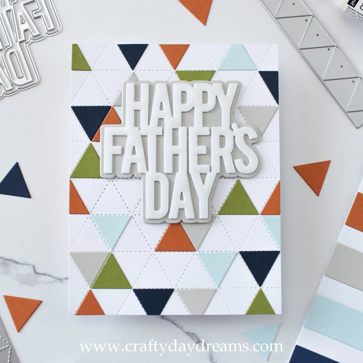
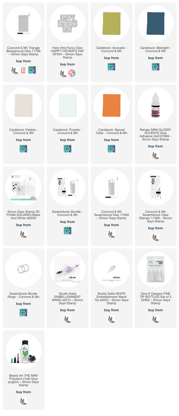
This week I created a swatch with Avocado, Spiced Cider, Pebble, Powder, and Midnight cardstocks, and I love it! Sometimes I get really sick of using your typical blues and greens on masculine cards, so this palette is perfect for me. It can lean masculine, but also would be perfect for fall! I started this card off by die cutting the Triangle Background out of plain white cardstock (I do this because I don’t want to waste my good C9 white cardstock, but you can use any! It just doesn’t matter to me since I will glue this onto a card base). I love that Concord & 9th included two triangle strip dies in this die set, it allows you to die cut two colors at once, or even just more of one color, so I quickly die cut all my triangle colors.
When it came to placement, I had no plans whatsoever. Since I had 5 colors instead of 6, I decided not to make the ‘beach ball’-like arrangement where each hexagon of triangles is colored like this fabulous example from Laura Bassen. I decided to have a random scattering of triangles, but did my best to keep the colors feeling balanced and the cardstock to feel full enough so there wasn’t patches of white space drawing the eye. It was kind of nice, this card came together in a snap, and I didn’t have to think hard at all about placement! I glued the triangles down, trimmed off those hanging over the edge, then moved on to the sentiment.
I picked up the Hero Arts ‘Happy Father’s Day’ die set over a month ago because I didn’t have any sentiment dies for the occasion, and I’m so glad I did! This is the perfect ‘basic’ (not in a bad way) sentiment die to have, it’s clean and simple. I die cut the shadow layer out of Pebble cardstock because it had just the right amount of softness to it where it wouldn’t be too overwhelming or heavy to the eye like it would if I used Midnight cardstock. Since I was keeping this card a bit more simple, I die cut the sentiment three times out of plain white cardstock to build up some dimension. I played with the idea of using gold cardstock for the greeting, but white just felt better, it really popped. So I glued it down onto the shadow layer, then popped the sentiment up on some thin foam squares and stuck it down on the card front. After looking at it for a little too long, I decided it was a little plain (which is totally fine!), so I pulled out my glossy accents and glossed up the words. I like the shine this brings to the card since I wasn’t going to add sequins, and I didn’t have matching enamel dots in the same color as my cardstock.
So what do you think of this card?! I love how it turned out and especially love how quick it came together. I think it maybe took 30 minutes or so total, which is amazing! I hope you have a fabulous weekend where you are, and I’ll catch you next week with more inspiration! 😊
Affiliate disclaimer: all links to Waffle Flower, Altenew, Scrapbook.com, and Spellbinders products are affiliate links. These links allow me to get a commission at no extra cost to you if you use them to shop! All other links provided are links to supplies and shops I am not affiliated with and I do not get a commission from.


