Concord & 9th—Mystic Moth Inlay Die Two Ways!
Soooo… this content is from July 😅. Better late than never, right?! If you hadn’t heard, I was a lucky girl this past July because Concord & 9th asked me to guest design with them again! 🙌🏻 This was my third time doing so and I’m just as incredibly grateful as I was the very first time they asked me!
July’s release had a wonderful array of products that were fun and summer-y and some that would work all year round. Today’s post is all about the Mystic Moth Inlay die which is one of the two inlay dies they released (I’ll have another post on the Posies soon!). Now, the cards I made today are definitely opposites of one another! On one hand I have a cozy Fall palette that’s bringing some moody vibes, and on the other, I have a much brighter and cheerful birthday card. We love duality in this craft room!
Dark & Cozy
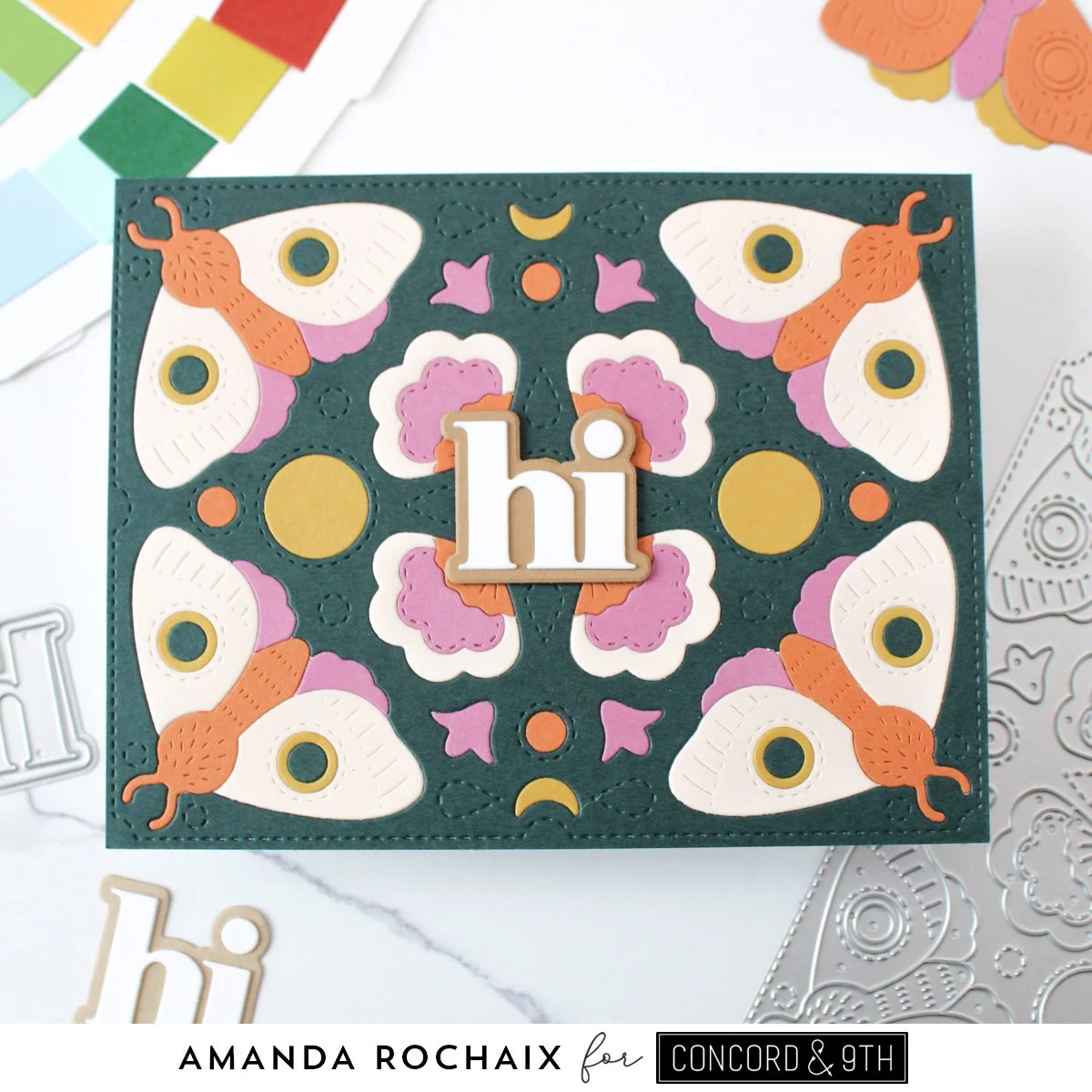
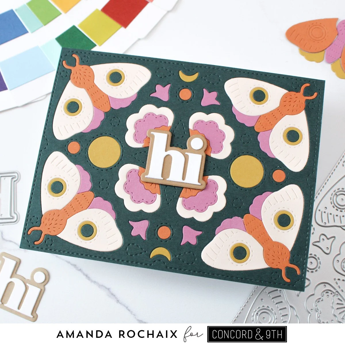
I mean, how Fall-like does this feel? 😍 I love the cozy, moody vibes of this card, and believe it or not, I did base this color palette off another card I made this month that I just tweaked two colors in (but here is my overall inspo). With that said, the color palette here is Rainforest, Spiced Cider, Briar Rose, Stardust, and Almond. Now, you might be thinking, Almond?! Yes! Almond is one of the new colors introduced in the Neutrals cardstock pack that Concord & 9th released in July, and it is the lightest color that pulls a little bit ivory-like, but with a bit more warmth. It’s a gorgeous neutral that I wish they would sell separately in larger packs because I do love an ivory!
With my colors picked out, I ran the Moth Inlay die through my die cut machine with an A2-sized piece of each cardstock, then divided all my pieces into piles (like wings, bodies, etc.). I decided Rainforest was going to be the card base color, so I glued my die cut panel onto a piece of white cardstock (you could definitely glue this to a folded notecard instead!).
After fiddling around a bit, I decided that the wings of the moths would be Almond, the bodies Spiced Cider, and the lower wings would be Briar Rose. I loooove these colors together! For the wing details, the circle outline is Stardust, and the dot is Rainforest. There’s a nice contrast with all these colors together, and I really love that! With that figured out, I got to gluing everything down. For the center details/elements of the panel, I did my best to mimic the moths and balance the colors, and once I was happy, I glued everything down.
Because I loved this panel so much, I really struggled on what to use as a sentiment since I didn’t want whatever I chose to detract from the background. I settled on the ‘hi’ from the Just Say More dies and I die cut the word out of white cardstock and the shadow out of Peanut. Peanut is another one of the beautiful colors in the Neutrals cardstock pack and I really love it! It’s the midtone of the colors included, and it’s so warm and rich and cozy! I thought it was great to lean into the neutrals for my greeting so that it wouldn’t stand out too much or take away from the color on my panel. I die cut a few more ‘hi’s and stacked them up on the shadow layer, then popped some thin foam squares on the back of the shadow so I could get a bit of dimension on this card. I decided to stick the sentiment down in the middle of the card front, and honestly, I’m really happy with it! It kind of reminds me of a Rorschach test or something like that!
Light & Bright
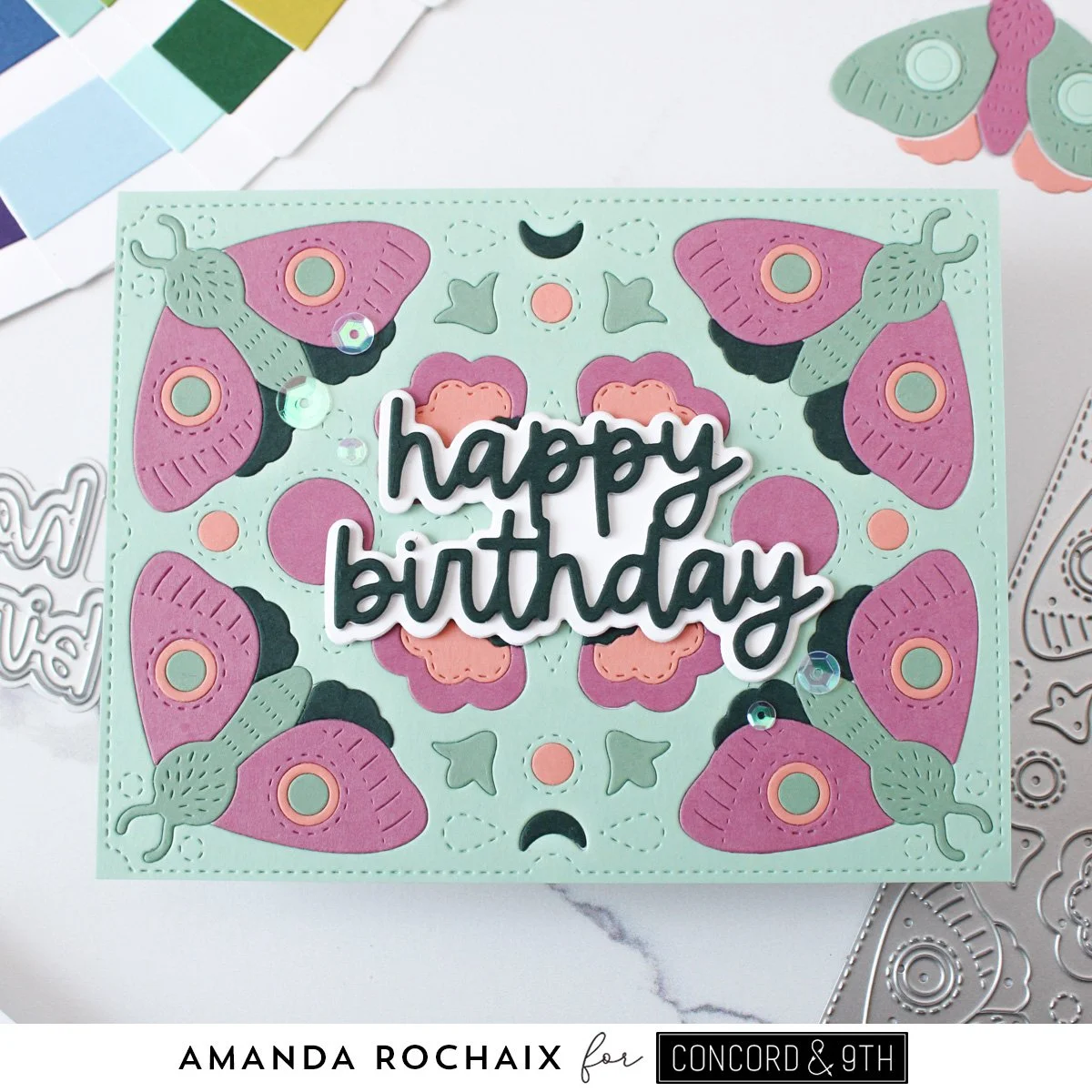
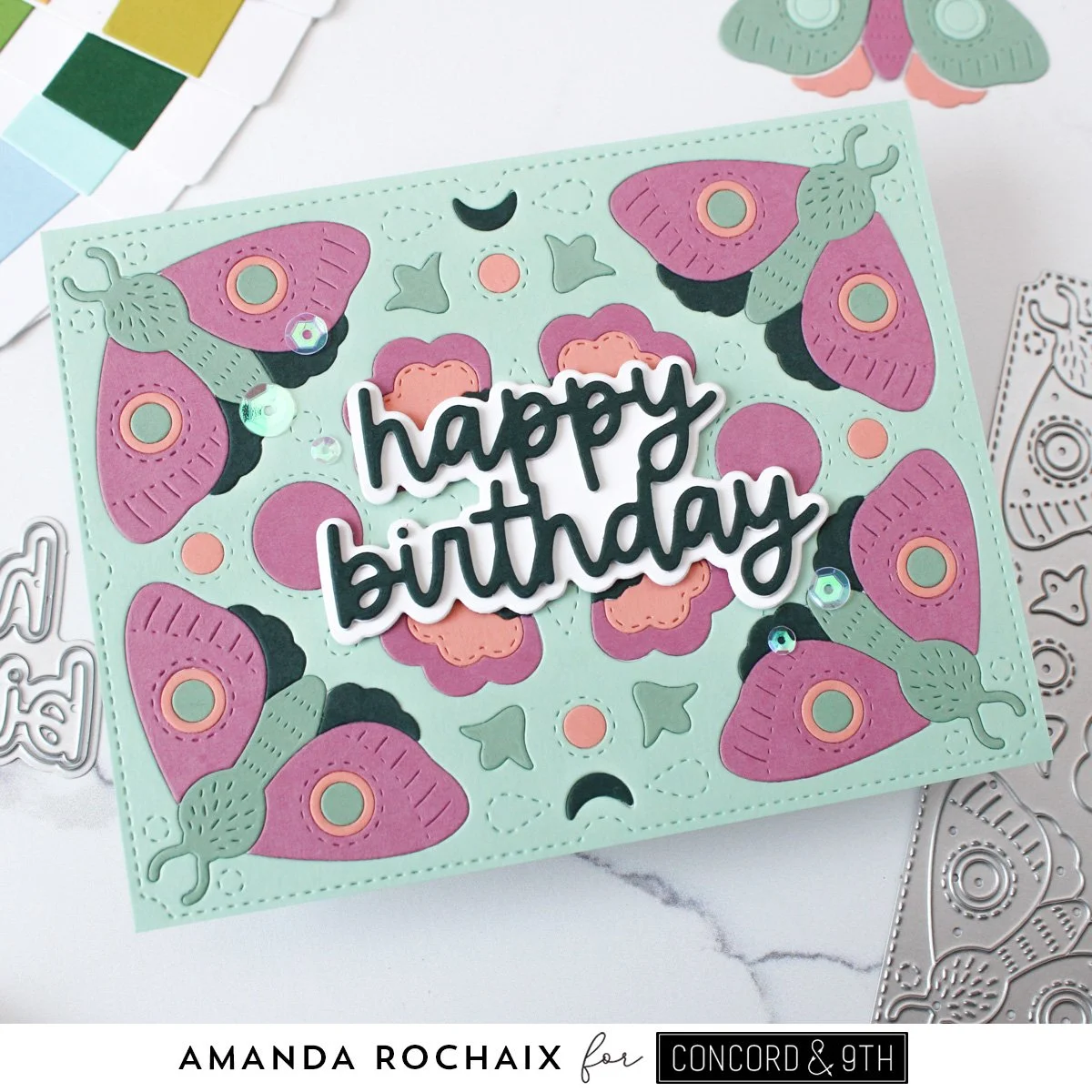
All right, so this one is much lighter than the last card, but I still used some of the same colors! I’m not sure what it was, but Briar Rose really came out on top for me when I was creating this month, so don’t be surprised when you see it on more cards haha! My color palette for this card was Sea Glass, Tidepool, Briar Rose, Grapefruit and Rainforest. I love how these colors look together! I never thought I would be using Sea Glass and Tidepool on the same card, but here we are!
After die cutting all of my panels, I decided on using Sea Glass as my card front color because I liked that it wasn’t too dark, but it is also one of my favorite colors. Since I was using Rainforest and Briar Rose again, I had less pieces to choose from than my other colors, so I focused on figuring out what I wanted as those colors first. I settled on the wings being Briar Rose and the lower wings being Rainforest. Since that left me with Tidepool and Grapefruit, I realized I didn’t like the bodies being Grapefruit, so that left me with Tidepool, and the wing detail circle outline as Grapefruit and the circle as Tidepool. I really like how these moths turned out, I feel like the tones of the colors play really well together and things feel balanced.
For the rest of the background, I again figured out what colored pieces I had in Briar Rose and Rainforest and built from there. I have a bit more Briar Rose in the center, but I feel like it mimics the moths in that way, so it doesn’t feel too overwhelming to the eye. I added Grapefruit dots and a scalloped layer, Tidepool little flower bud things, and Rainforest as the smallest scalloped layer.
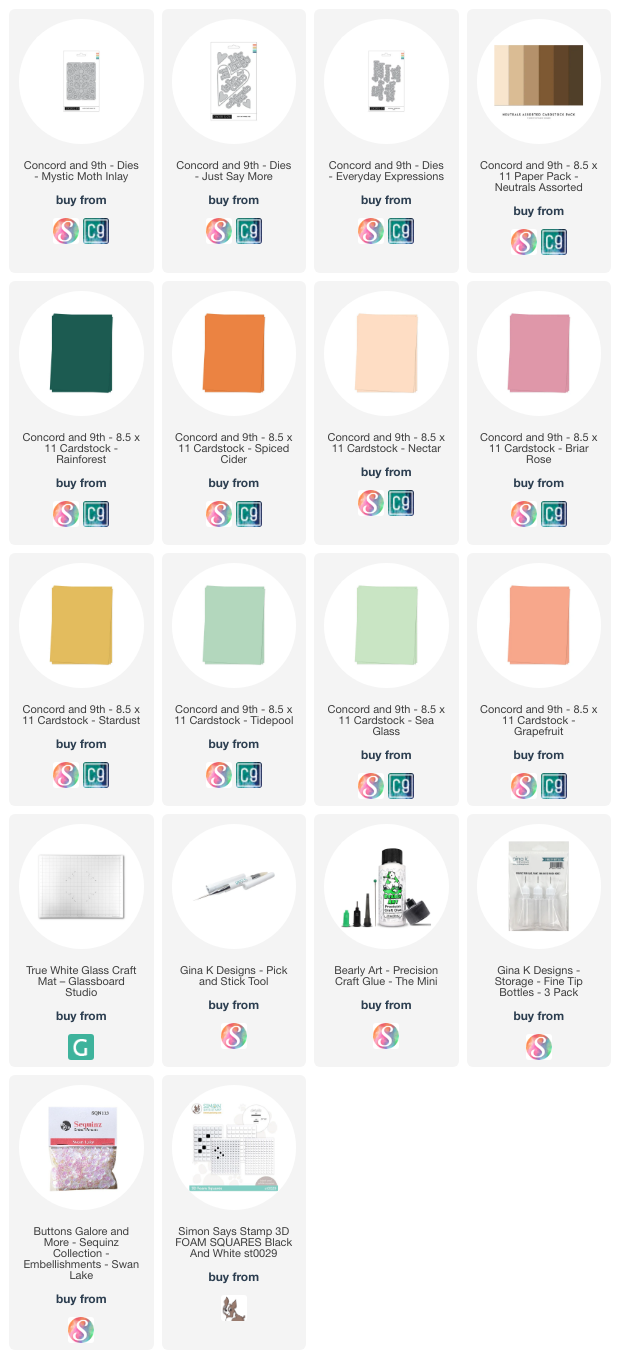
Again, I felt the background was too pretty to cover too much of it up, but I didn’t want to use the ‘hi’ again that I used in the first card, so I went digging through my stash and pulled out the ‘happy birthday’ from the Everyday Expressions die set. I think the scripty/handwritten vibe of the sentiment is perfect for this card and this color scheme—it’s so fun and playful! I die cut the shadow layer out of white cardstock and the ‘happy birthday’ out of Rainforest and a few layers of white. I thought Rainforest would be great to tie back into this card since there wasn’t too much of it on it and it really stands out against white cardstock. I popped the sentiment up on some thin foam squares, and stuck it down on the center of the card. To finish things off, I thought a little bit of shine would be fun, so I pulled out some Swan Lake sequins from Buttons Galore & More and a larger set of sequins in the same color from Darice (I got these at a local scrapbooking store years ago and, unfortunately, I don’t think they’re sold anywhere now). After a bit of fussing and overthinking, I figured out an arrangement of 5 sequins around the sentiment that I was happy with and glued down. I love the way this iridescent sequin plays with the colors of this card!
And that wraps up this post! What do you think of these two cards?? Is there one that you like more than the other? I thought the dark & cozy card was my favorite, but I don’t know!!! Now I can’t choose haha! Thanks so much for stopping by the blog today, I hope to catch you next time! 😊
Affiliate disclaimer: all links to Waffle Flower, Altenew, Scrapbook.com, and Spellbinders products are affiliate links. These links allow me to get a commission at no extra cost to you if you use them to shop! All other links provided are links to supplies and shops I am not affiliated with and I do not get a commission from.
