Concord & 9th—Lovely Garden
Hi, Friends!!
Long time, no see! So sorry for being MIA again, but my husband and I moved into our new house at the end of August, so things have been a bit chaotic for us these past few months! I’m soooo behind on blog content, but if you want to see what else I’ve been sharing over the past few months, check out my Instagram! And, since I’m so behind, if there are blog posts you want on specific cards, let me know in the comments below and I will do my best to prioritize those!
Today’s post features the Lovely Garden bundle from Concord & 9th and Scrapbook.com. This set was a collaboration/only sold at Scrapbook.com that was released the weekend of C9 Summer Camp this year, and when I saw it, I about died. I absolutely looove this set!!! Obviously being a floral girly it was right up my alley, but the other thing I’ve been loving lately is ‘puzzle piece’ cardmaking. What I mean by ‘puzzle piece’ cardmaking is that the die set creates a road map for you and all you have to do is die cut your pieces and slap them on where you see the space for them on your card front. It’s perfect brainless crafting similar to how it is with inlay dies and I love it.
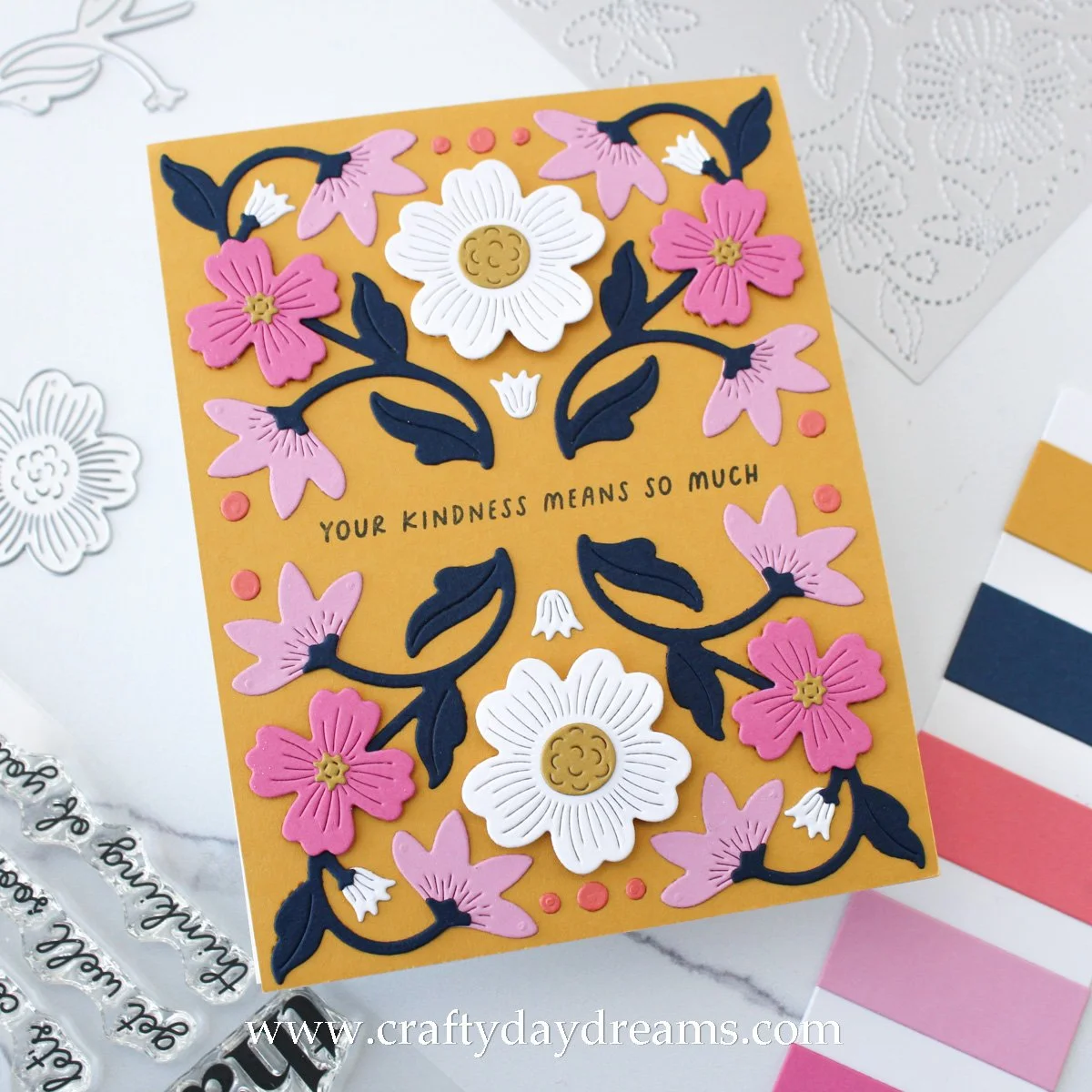
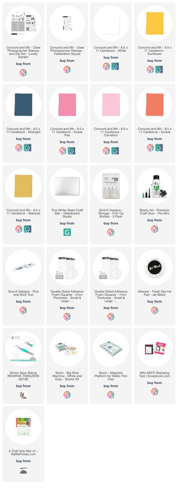
I’ve been dying to use this set since I got it a few months back, but I’ve been struggling to find time to craft for me lately, and this past week I finally had the time, energy, and motivation 🙌🏻. Pinterest can be a great source of inspo for me and a while back I pinned this pin as color palette inspo, and after looking at it again, I knew it was the one to try with this die set! For my color palette, I decided on White, Carnation, Sweet Pea, Sorbet, and Midnight cardstocks for Concord & 9th. It’s a bold color palette, huh?!
Bold Color
Since I was following my pinned inspiration, I ran an A2-sized panel of Sunflower cardstock through my die cut machine with the stitching panel die included in the set. Then I die cut my leaves/stems out of Midnight, the side-facing florals out of Carnation, the medium-sized flowers out of Sweet Pea, the large flower as well as the buds out of white, and the small dot details out of Sorbet. I really like having the buds as white because I feel it brings a balance to the card since it brings in more white than just the main flower. For flower centers on the large and medium flowers, I decided on Stardust cardstock since it was darker, and I liked it a bit more than Buttercup (which is the ‘buddy’ to Sunflower).
With all my pieces ready to go, I stamped my greeting (this is important to do now in case you plan to add dimension, which could make stamping difficult later!), the ‘your kindness means so much’ sentiment from the coordinating stamp set, in Altenew Jet Black ink in the empty space between the mirrored designs. I started to put this card together and glued down my ‘flat’ things: the Sorbet dots, the white buds, and the side-facing florals. It is imperative that you glue the buds and side-facing florals down before you glue down the leaves/stem pieces because they have little details that cap off the bottom of the flower/bud. With that done, I glued down the stems/leaves, then got to thinking about how much dimension I wanted for my front-facing flowers. For this card, I decided to use 1mm foam squares from Scrapbook.com on the Sweet Pea flowers, and to add a little bit more dimension, I popped the large white flower up on 2mm foam squares. I like the different dimension, it’s pretty fun!
And that’s it!! This card comes together super quick once you have everything ready to go!
A Little More Lowkey…
Alright, so I was in love with this color palette a bit too much to just make one card, so I decided to make another, but make it the opposite! Where the last one was bold and vibrant, this one is a bit more chill and relaxed with a white background. After a little bit too much thinking, I decided to just flip the color of the large flower and the small buds to Sunflower and keep the rest of the colors/flowers exactly as they were on the last card. I feel like things feel pretty balanced, and if I switched the Carnation flowers to Sweet Pea, things could feel very vibrant and in your face since Sunflower and Sweet Pea are so saturated and would be next to each other. The only change I made was making the flower centers white because Stardust didn’t pop enough, and neither did Wheat, so the white just brings another pop of that color to the card.
Before slapping all my flowers on, I stamped my greeting. I really loved the sentiment I used on the last card and how it fit in the empty space, but since I didn’t want to use the same one I went digging through my stash and pulled out the Celebration Squad stamp set. I love the font it has and how the delicate script is mixed in, not to mention the sentiment is great, so I decided to stamp that in Jet Black ink. Be sure to raid your stash for sentiments too because I know C9 has many newer stamp sets with the same type of fonts!
So for adhesing, I followed the same steps as the previous card and glued down all my flat things, then the leaves, but this time I decided both the large and medium flowers would be popped up on 1mm foam squares. I like the subtle dimension that this card has, but I also like the different dimension on the last card too!
Well, that wraps up this post!! How gorgeous are these cards?? I love them both so much, and I can’t wait to use this set more! Please let me know below what cards I have shared on IG over the past few months you’re dying to know more about, and I will get writing!! Thanks so much for stopping by today!💗
Affiliate disclaimer: all links to Waffle Flower, Altenew, Scrapbook.com, and Spellbinders products are affiliate links. These links allow me to get a commission at no extra cost to you if you use them to shop! All other links provided are links to supplies and shops I am not affiliated with and I do not get a commission from.


