Sizzix—More Stamp & Spin fun!
Hello, hello!!
Today I’m back with more cards featuring the Stamp & Spin and some new stamp sets from Sizzix! The other day I shared a blog post walking you through the new tool from Sizzix and my thoughts, so check that out if you’re curious and want to know more!
The cards I’m sharing today all use stamp sets that are designed by Lisa Jones which can be mix and matched on a card thanks to the cohesive design style. These sets are called Botanical Fruit, Nature Butterflies, and Garden Botanicals. I had a lot of fun playing with these sets and creating these cards, but my second card really steals my heart!
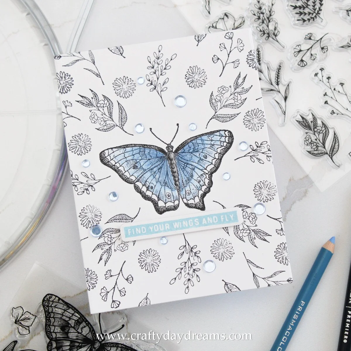
Floral Butterfly
I had so much fun stamping this out! Though it definitely was a little bit harder since the large butterfly I put in the center of the card is not perfectly symmetrical. With that stamped, I decided to add a leafy floral branch (the one roughly at each wing tip) which I stamped it four times, so I had two clicks between each one. Next, I added the more rounded leafy sprig between the floral branches, again going two clicks between each one. To fill in the gaps a little bit, I pulled a small flower from the butterfly stamp set and stamped it 8 times, going one click per turn.
From here I just kept building and filling in white space to the best of my ability. I added two other sprigs, two solo leaves and the small flower one more time. Once I thought things had filled out enough, I die cut my panel to A2 size using my A2 Layers dies. I found a sentiment that was perfect for this card from the Good Vibes #3 stamp set that I just had to use, so that inspired the rest of this card.
Since ‘find your wings and fly’ felt so inspirational, I decided to only color the butterfly to really reinforce the sentiment and add some impact. I ended up buying some Prismacolor colored pencils to color this in, and let me tell you, coloring with colored pencils is not a skill I have mastered at all haha! I’m honestly a little embarrassed to be sharing this card since I don’t exactly love how I colored the butterfly. I ended up using Black (PC 935), Light Cerulean (PC 904), and Indigo Blue (PC 901) pencils to bring some life to this card. To tie into the blue, I stamped my sentiment using Harbor ink and die cut it using a sentiment die from Altenew.
I popped the sentiment up on some thin foam squares and stuck it down below the butterfly. I felt something else was needed, so I pulled out Ocean Jellyfish sequins from Trinity Stamps and threw on a scattering of blue ones. Not too bad!
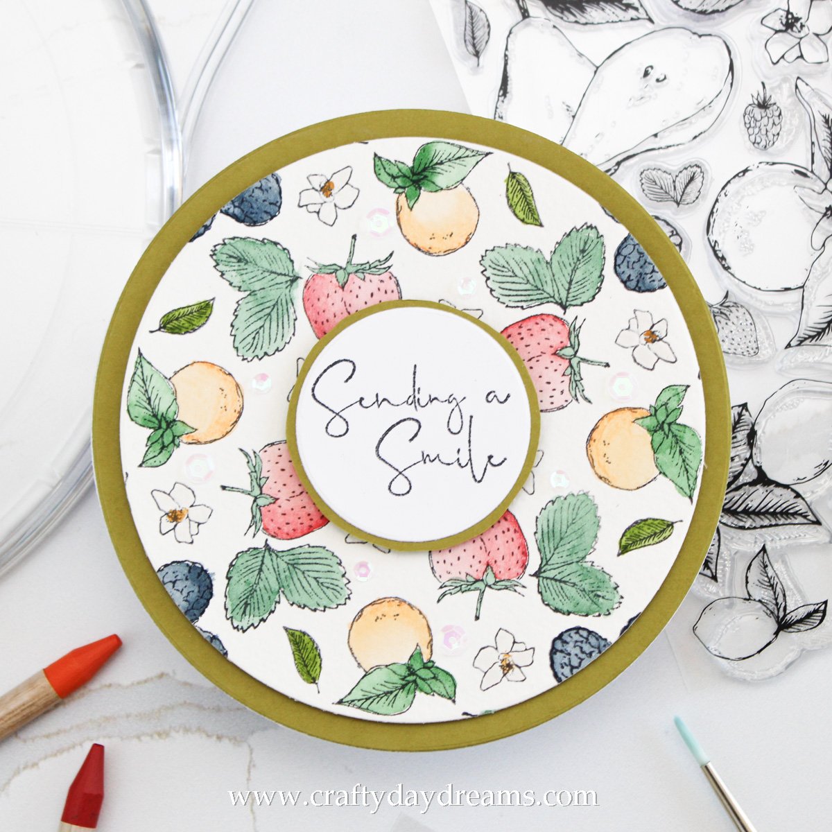
Fruity Fun
Isn’t this one so cute?! I really wanted to make a pattern using some of the fruit from the Botanical Fruit stamp set, but I wanted to avoid more colored pencil coloring and instead decided to watercolor this time around. Since that was my plan, I pulled out a 9 x12-inch sheet of watercolor paper from Altenew and stuck it down on the Stamp & Spin platform. I lined up the strawberry pretty close to the blue circle on the tool, stamped it down using archival black ink, moved the position two clicks and stamped again. I repeated this four times. I decided to add the large leaf cluster to one side of the strawberry and repeated the same stamping process. I felt a little flower was necessary to fill a little bit of a gap on the other side of the strawberry, so I quickly added that.
For the next row, I decided oranges were the way to go. I stamped four of them, then decided to repeat my little pattern of a leaf and a flower on either side of the fruit. This time I did flip which side the flower and leaf were on to add a little bit more variation. For the final row, I added blackberries, and again a flower and leaf on each side of them, though you can’t see it since it ended up getting cropped off.
With everything stamped, I pulled my paper off the platform and taped it down to a hardboard using some painter’s tape. I was planning to mainly use my set of Tim Holtz watercolor pencils for this, but I wasn’t really feeling the greens in my set, so I pulled out my watercolor palette. In my personal watercolor palette, I use Winsor and Newton Cotman watercolors, these are very budget friendly and a great starter ‘student grade’ watercolor series.
To start of my painting, I decided to paint the small flowers using Chinese White and using a fairly pigmented mixture of it. Once I painted all the petals, I added a flower center using Yellow Ochre and dabbed it with a paper towel if the intensity was too high since my paper had dried, not allowing me to use the wet-on-wet technique.
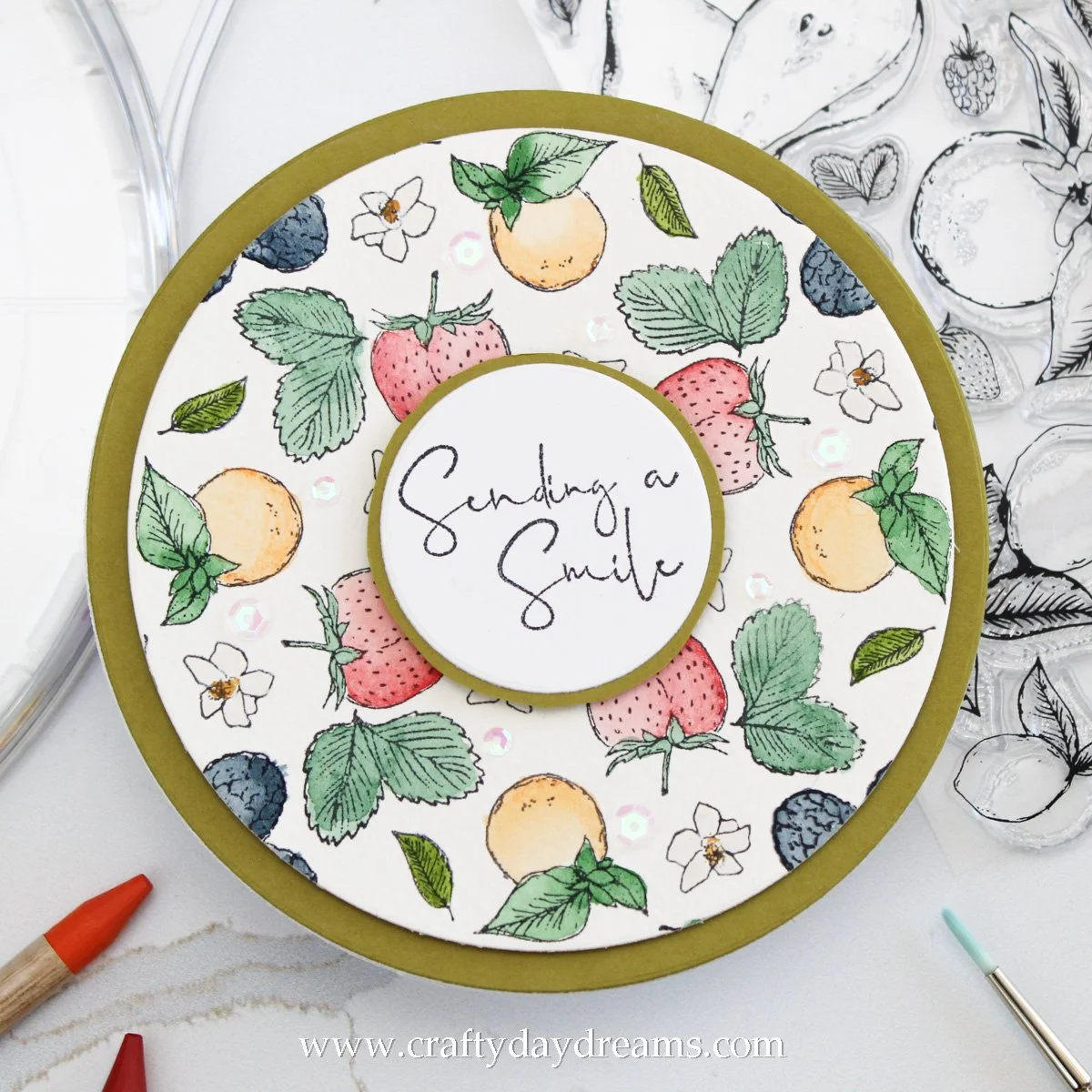
I’ve been chomping at the bit to use my Tim Holtz watercolor pencils, and I’m so happy to have used them on this card! They blend out like an absolute dream and have such a creamy texture. I pulled out Barn Door and colored about a third of each strawberry, then added a little bit of darkness to the outer edge with Seedless Preserves. With the colors laid down, all I had to do was wet my watercolor brush and blend them out. I really wanted a bit of a gradient blend to them, so I blended out the most intense color, then wet my brush and ran it along the side of my water jar to remove extra water and a little bit of pigment, then finished up the other side of the berries. For the stem and surrounding leaves, I used Hooker’s Green Dark, I think this green looks really nice with the strawberries!
Next up is the oranges! I wanted to use the watercolor pencils a little bit more, so I pulled out Spiced Marmalade and followed the same steps as I did on the strawberries, applying the color on the left side of the fruit and blending it out with water to the right. I feel like the tone of the orange feels a bit more ‘highlighter-y’ than I would like, but it works! For the leaves on the oranges, I used Hooker’s Green Light and played with a little bit more wet-on-wet technique to get darker blends at the center of some of the leaf bunches. It didn’t work perfectly since on some of my leaves had already dried down pretty well before I added the shadow since I was using a smaller brush which causes it to hold a little bit less water and therefore dry a lot quicker. For the leaves between the oranges, I used Sap Green and I absolutely love how this looks here! It adds a nice bit of warmth to the pattern and it’s such a pretty color.
Now for my last basically unseen row of fruit and leaves haha! I decided to make the berries into blackberries since I thought the color of them would pop a bit more than if I had made them raspberries or colored them in with Seedless Preserves. So, I ended up using Indigo paint and attempted to make the left edges of each fruit more shaded and blend the color out to the right, just like I had with the other fruit. I definitely didn’t get the depth of color that a blackberry had on these, but I think the color worked out just fine and brough the right brightness. I did paint the stems/leaves of these berries with Sap Green, and I’m so bummed they got cut off because the color combo is magnificent. For the leaves between the berries, I pulled back into the other greens and used Hooker’s Green Dark on them. I really love how this turned out!
At this point, I was ready to make this bad boy a card. I pulled out my nesting circles dies from Simon Says Stamp and used the second largest one to crop my panel, which made it roughly a 5-inch circle. I really wanted to mat the circle, so I pulled out what has become a favorite card base of mine lately—Grasshopper cardstock from Concord & 9th. You’ll be seeing it more in the coming weeks 😉. So, I cut the Grasshopper cardstock using my largest circle, which created a 5.5-inch circle, popped some foam tape on the back of my watercolor panel, and stuck it down on the green circle. To create the shaped notecard, I cut an 8.5 x 11-inch piece of cardstock down to 6 x 11.5-inches, scored and folded it in half, then hung maybe about a 0.25-inch of the circle die off the folded line and ran it through my die cut machine.
For my greeting, I chose the sentiment ‘sending a smile’ since I could squeeze it into a circle, but it also felt super cute with the fruit! I stamped the sentiment using Altenew Jet Black ink, then die cut it with a nesting circle die to roughly 2-inches. Now, here comes my desperation haha. I wanted to mat this circle on some more Grasshopper cardstock so that it visually seperated itself from the background, but all the circles that I had that were larger covered up too much of my precious strawberries! So, I ended up taking the same die I used to cut my sentiment circle, tracing the outside edge of it on Grasshopper cardstock, then fussy cutting it out. It is soooo far from perfect (hello wonky edges), but desperate times call for desperate measures, and you probably wouldn’t notice it if I hadn’t pointed it out!
To finish this card off, I again wanted a hint of sparkle, so I pulled out Swan Lake sequins from Buttons Galore & More and scatterer them around in a loose pattern between the strawberries and next to the oranges. I think this little touch is so cute!
That’s all I’ve got for you today! I really hope you like these cards, and if you have a Stamp & Spin I have inspired you to get creating! Honestly, using it is the most fun I’ve had stamping in I don’t know how long haha! Thanks for stopping by the blog today, I hope to catch you next time with more inspiration! 😊
Affiliate disclaimer: all links to Waffle Flower, Altenew, Scrapbook.com, and Spellbinders products are affiliate links. These links allow me to get a commission at no extra cost to you if you use them to shop! All other links provided are links to supplies and shops I am not affiliated with and I do not get a commission from.


