

Concord & 9th— Autumn Hues Bundle

Hi Crafters, happy Friday! Welcome back to the blog!
Today I’m sharing two cards I made using products from the Autumn Hues bundle that Concord & 9th released this past August. These products are so fun to use and are super easy to combine with those that are fall themed already in your stash! I’m already thinking of some other cards to make now, so stay tuned for those!
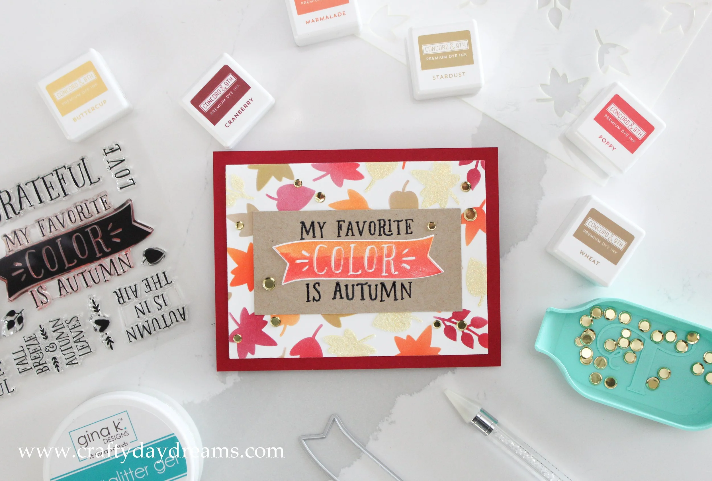
This was the first card I made with the bundle, and it’s so fun! I like that the stencil pack came with two options, one for a full leafy background, and one for a wreath. These are Turnabout stencils, and they are super easy to use! You just pick your stencil up and rotate it a quarter turn, ink it up again, then repeat until you hit four turns.
I went with a very basic fall color scheme for these cards, so I started off with Buttercup ink. I decided to add a little bit of shading to some of the leaves by focusing Stardust ink at the base of the leaves. I picked the stencil up, cleaned it off, and moved onto Marmalade for the next turn, and also added some shading to the base of the leaves with Poppy ink. Marmalade and Poppy are the ultimate dream ink combination—especially for fall! It really reminds me of the color of Maple leaves when they are fiery red. For the third turn of the stencil, I blended on Cranberry ink (which is another amazing color 😍) and then went back to Poppy ink to lightly add it to the tips of the leaves. I was really hoping to make the leaves look like they were either at peak color change, or starting to fully darken and die/go brown. My last turn of the stencil was with Wheat ink, the perfect color for crinkly leaves.
Once I was done inking, I got the idea to use Glitz glitter gel, so I decided to add it over the yellow leaves. I’ve only used Glitz glitter gel once when I made my popsicle cards, so I was excited to try it again! While the glitter layer dried, I got to work on my sentiment. I decided to use the ‘my favorite color is autumn’ sentiment, but I knew I wanted to ‘color’ portion to be bursting with color. First, I black heat embossed the sentiment on Wheat cardstock, mainly applying Versamark ink onto stamp except where it said ‘color’. Then I applied Marmalade ink onto the upper portion of the ‘color’ banner and used a blending brush to soften the line. I repeated this step on the bottom of the banner with Poppy ink and did my best to blend the colors. However, I think my paper shifted out of the corner of my MISTI, or maybe I got ink into the etched part of the words, but there’s a bit of a shadow on my banner, but I actually really like it!

I die cut the banner and glued it over the where the hints of the embossed one was. I trimmed down my stenciled background and mounted it landscape on a Cranberry card front, and I glued the sentiment on. I finished the card off with some Gold Coin embellishments from Trinity Stamps which are perfect for this color scheme. I love how this card turned out! It’s quintessentially fall.
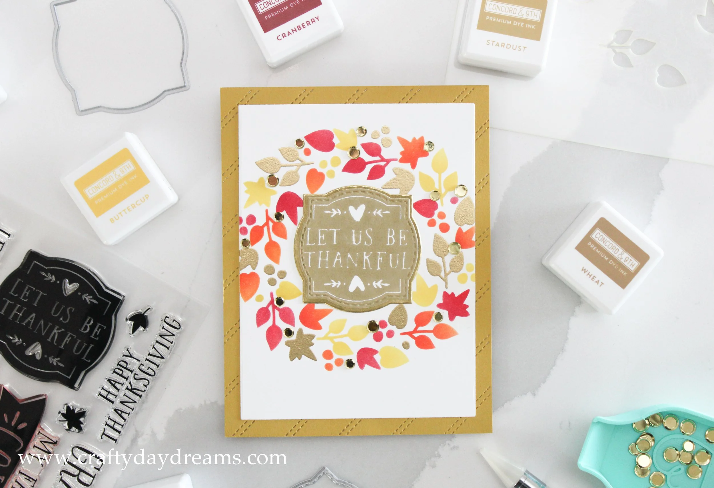
While working on the previous card, I was struck by the idea of having some gold heat embossed leaves. Nothing goes with warm, fall colors more than gold! I started this card off inking Buttercup leaves and adding some Stardust ink to add some dimension. My second turn of the stencil, I used Marmalade ink and added a touch of Poppy ink to the base of the leaves. For the third turn I used, you guessed it, Cranberry ink! I followed suit as before and added a hint of Poppy ink to the tips of the leaves. For the final turn, I used a foam dauber and Versamark ink to press ink into the holes in the stencil. I then used Gilded embossing powder from Brutus Monroe and hit it with my heat tool. Just be sure to clean your stencil off quickly! I let mine sit a bit and theres a hint of residue that I’ll likely have to try and scrub off. (Though I’m not concerned/mad about it).
Don’t these colors look so good with the gold embossing?! I made this card with Thanksgiving in mind, so I chose the sentiment ‘let us be thankful’ and stamped it in Wheat ink on white cardstock. On Concord & 9th’s website and all their samples with this bundle, they used the larger coordinating die to cut this sentiment out, but I realized the stitched smaller die fit it perfectly, so I die cut it with that. I decided to cut a piece of C9 Gold cardstock with the larger of the two dies to mat the sentiment on it. I love the subtle hint of gold it adds.
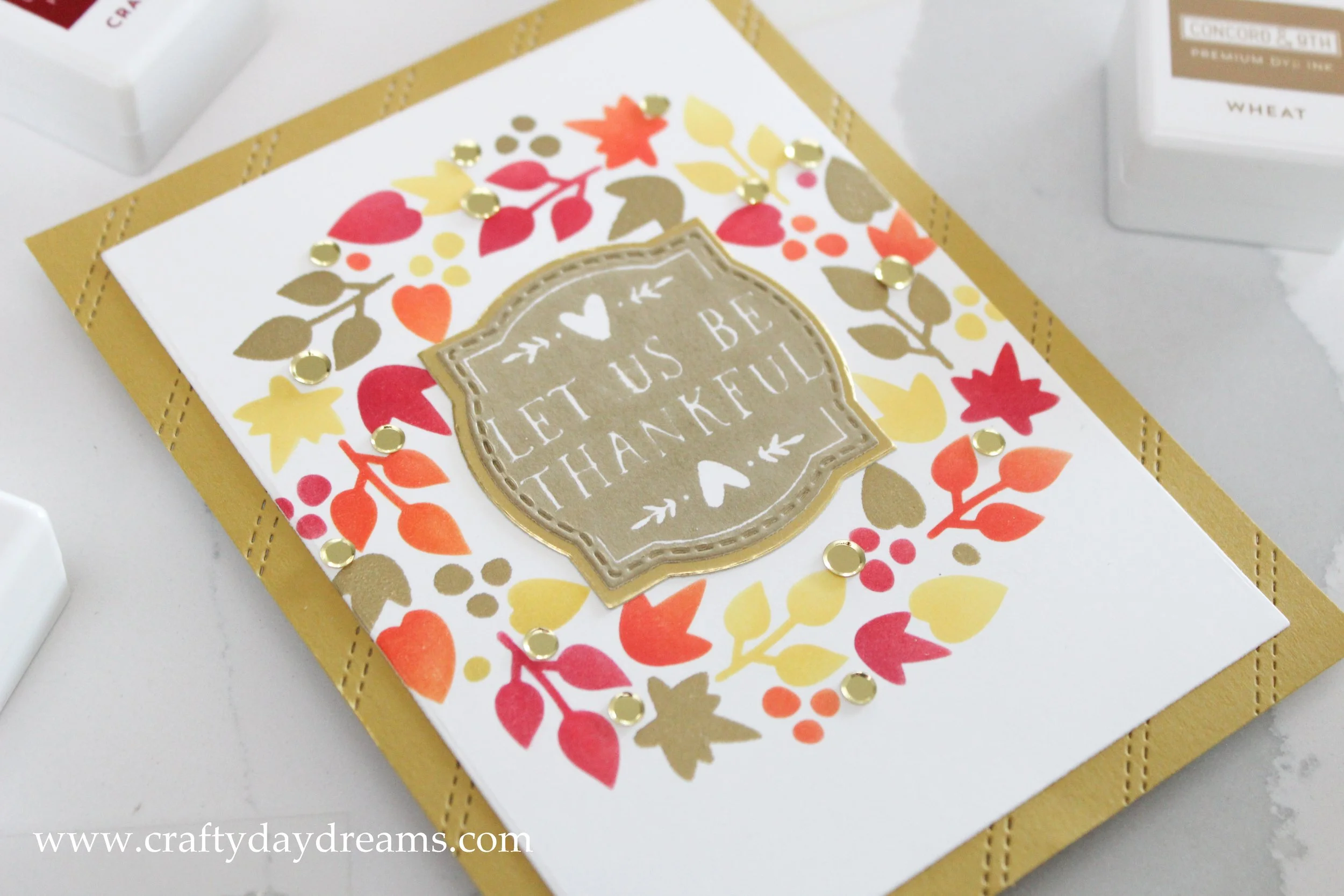
I cut down my wreath panel and mounted it on a panel of Stardust cardstock that I used the Stitched Stripe card front die on. I like the texture this added to the card! I glued down my sentiment in the middle of the wreath and finished the card off by gluing sequins randomly around the wreath for some extra shine.
I like how these cards turned out! They were quick and easy to make, and without too much thinking. Do you have a favorite out of the two? Let me know below!
Thanks for stopping by, and I hope to catch you next time! 😊